And to join in the crowd, my observations about the new Surface product line and presentation by Microsoft.
First off, from a conceptual point of view, the package definitely looks interesting and should hopefully add some more dynamism to the tablet market. I really like the idea of the multi touch keyboard cover, and despite many of the people decrying the fact that typing on a virtual keyboard is harder than a physical keyboard, my personal experience shows that it’s just a matter of practice. In fact I have a friend who recently observed that he is faster typing on his iPad than on a regular keyboard so it’s not just me.
The big win here is the fact that you don’t lose half of your screen real estate when you need the keyboard.
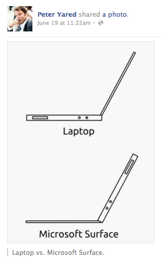
The kickstand is an interesting twist and certainly looks a lot more solid than most of the ones I’ve seen on Android tablets. There’s one thing that troubles me here though and that is the fact that as the following snarky illustration points out, it maintains the ergonomics of a laptop.

One thing I like about using the iPad in meetings with the smart cover is the mode where it’s slightly inclined on the table in front of me which also works reasonably well on my knees in the train. The key thing is that iPad is just a screen down on the table in front of me, while the vertical orientation of the Surface with the kickstand open forms a wall between me and the other people around the table, just like the wall of notebooks I see today. It’s a subtle thing, but it’s definitely a barrier between meeting participants. I don’t see any way the the slightly inclined option is possible with the Surface.
Reading about the devices was interesting, but it’s worth spending the time to watch the video of the event. You get the impression that this was thrown together as rapidly as the invitations. The hardware is not yet demo ready with several glitches during the presentation and journalists weren’t allowed to actually test them out.
The presenters gave the impression of not being comfortable with the script and it really felt rushed and nervous. Sinofsky who showed excellent presentation skills when presenting the Metro interface design philosophy at BUILD was clearly uncomfortable here. A justified lack of confidence in the readiness of the hardware?
I can see that the timing for this presentation has a tactical aspect in presenting the product before Google IO so that whatever is presented will be compared against the Surface. On the strategic front, this was almost inevitable given the ever shrinking margins in the hardware market. Making something of similar quality to compete with the iPad and the MacBook Air and then adding the cost of a Windows license is simply not sustainable. Asymco’s ever detailed analysis explains why.
But the whole event leaves open more questions that are critical in my ability to truly understand the product’s potential. As John Gruber points out, we just don’t have enough information to form an opinion at the moment.
Just a few of the questions:
-
how much?
-
where can I buy it?
-
what is the distribution channel?
-
when can I buy it?
-
will the released product be perfectly executed?
-
what is the upgrade path?
-
what is the consumer messaging for RT vs Pro?
-
are the IT management tools compatible with RT?
-
why no software demos?
-
…