I’ve been a fan of the iPad since the beginning and currently use an iPad Pro 10.5 and 12.9 for various types of work. One thing the iPad does very well is when you want to concentrate on writing, you can pull up your favorite writing app and go to town with nothing else distracting on screen.
Obviously, using the on-screen software keyboard is a non-starter for writing since you lose half of the screen and you have no tactile feedback. So over the years I’ve been trying out many different keyboards from various places trying to find something that suits me.
In this pursuit I currently have (bought by me) the following keyboard setups for the 10.5:
-
Novodio Pocket BT Keyboard
-
Incase Origami Workstation (discontinued)
For those of you looking around and trying to decide on what will work for you here’s a quick resume of my experience of using these. This is not a formal review with comparaisons, but more of a collection of observations. Starting from the bottom of the list:
Incase Origami Workstation
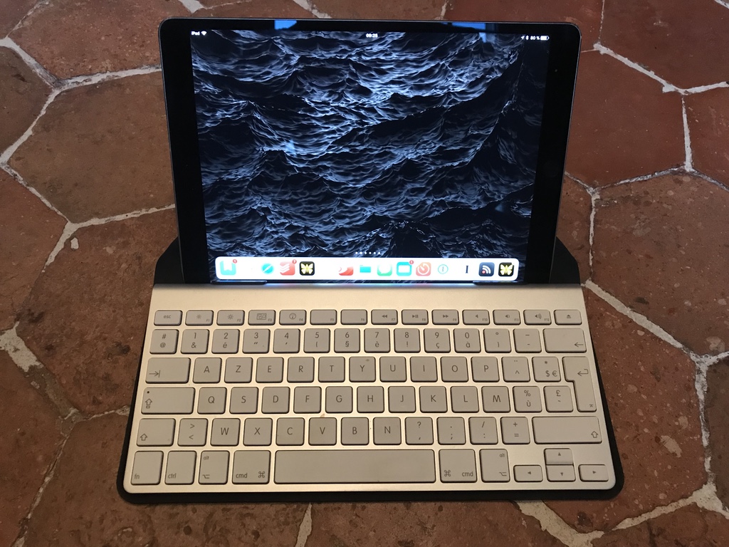
This was the original tool for using an Apple Bluetooth Keyboard with an iPad. Similar to the Studio Neat Canopy, it was just a case for the keyboard designed so that you could pose your iPad on the case when folded correctly to support it. Things I like about this one are the fact that it is completely independent of the model of iPad you’re using and there’s no constraint about using it in landscape or portrait mode. In fact you can even use it with just about anything iOS or Android. It looks a little funny with just a phone on the case but it works when you need it. It’s also case insensitive (sorry) and you can slot an iPad in with just about any kind of cover.
The things that are not so great:
-
It’s discontinued so eBay etc. is the only place you’ll find them
-
It’s based on the old model Apple Keyboard. Easy to find on eBay but…
-
It’s relatively thick and takes up a chunk of space in your bag
-
It uses AA batteries which always seem to run out at the least opportune moments
-
-
When the iPad is docked (as it were), the bottom edge of the iPad is behind the top of the keyboard which means that you can’t do the swipe up gesture from the bottom without lifting it out. And if you’re in portrait mode you can’t get to the home button either.
-
While this Apple Bluetooth Keyboard was really nice when it came out, today I find the action a little squishy and not to my taste. Now that I’m on current generation MacBooks, the difference feels even stronger.
This was my original preferred system for quite a while, but mostly reserved for around the house and office or on iPad only days out and about due to the size.
Novodio Pocket BT Keyboard
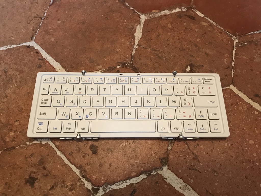
A throwback to the old Palm IV keyboard accessories, it’s a pocketable (but you need big pockets) tri-fold keyboard. The case can be refolded to supply a support that is useful if you want to use the iPad in portrait mode. For landscape it’s easier to use the iPad’s cover.
Unfortunately, this keyboard has so many faults. It barely lasted a week in the test rotation before driving me nuts. First off, it’s a truly generic keyboard with Windows and Android specific buttons, FN key overrides, multicolored labels and so on. It’s also too small from left to right which makes it feel cramped and I had a really hard time typing on it. The hinges interfere with resting your hands and if you type hard on the keys towards the edges, it flops around.
Also it’s yet another generic device that uses the Micro-USB for charging and has no iOS integration to let you know the state of the battery.
Upshot : Bleah.
Logitech Keys-To-Go
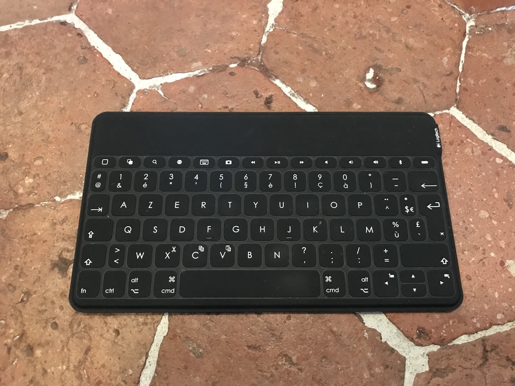
Another bluetooth keyboard not limited to just the iPad Pro. For quite a while, this was my favorite mobile keyboard. It’s incredibly thin and could live happily in the slot for the iPad in my bag without taking any noticeable space. A physical on/off switch so that it wouldn’t wake up in the bag with the caveat that you have to remember to turn it on and off yourself. Quick and easy pairing with an obvious Bluetooth button to hold down so switching between devices is not a big deal.
Given the size, it is surprisingly easy to type on. The key travel is short given that it’s very thin, but almost as good as the Apple Keyboard Cover. It’s also very light and you won’t even notice the fact that it’s in your bag.
It suffers the usual issues that it’s charged via Micro-USB, but it lasts a long time.
Of course, it has no integrated folding case or stand so you’re limited to whatever your iPad cover can do which generally means you can only work in Landscape mode. For most people this is a non-issue but when I’m writing I prefer to work in portrait so I can see the entire page. This may change a bit now that split screen multitasking has matured in iOS 11 for pulling up notes and resources while working.
Highly recommended as a mobile keyboard.
Studio Neat Canopy Keyboard Case
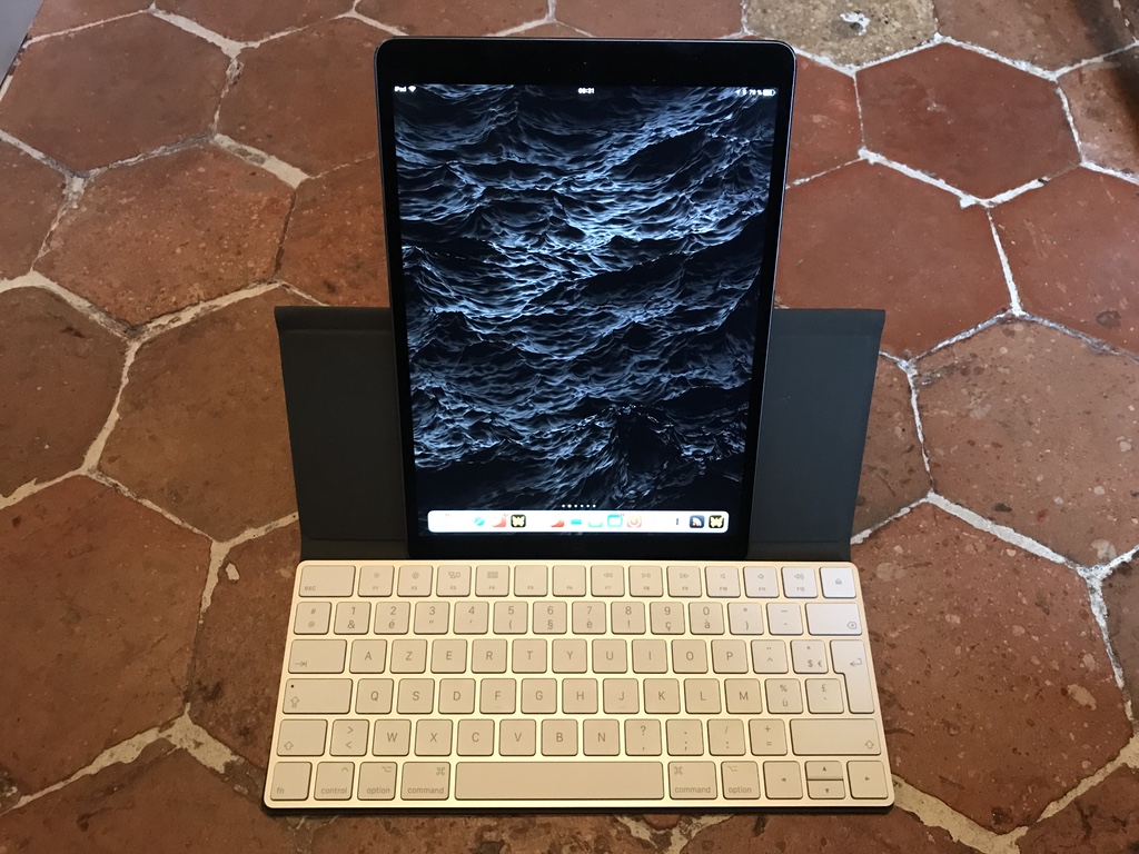
The lineage of the Origami Workstation is visible in the design, but updated for the modern Apple Magic Keyboard. Unlike the Workstation which clips the keyboard into place, they use a double sided sticky connection to hold the keyboard so once it’s in, that’s where it’s going to stay. You won’t be popping the keyboard in and out.
From a style perspective it’s much nicer than any of the others with the fabric cover and the old-school snaps to hold it closed and position it as a stand.
The feel of the Magic Keyboard is closer to the current crop of MacBook keyboards, but not the ultra low travel of the latest geenration. But if this is your desktop keyboard as well, this makes for a really good fit since your muscle memory will transfer perfectly.
Like the Origami, you can work in both landscape and portrait modes, but with the same caveat of accessing the bottom edge. In landscape, the swipe up from the bottom is a little difficult and the home button not really accessible in portrait.
If I were a full time iMac user with the iPad as my mobile device, this is probably the one I would use all of the time. It’s definitely more cumbersome that the Keys-To-Go and takes up noticeably more space, but it’s much thinner than the Origami. But as I am MacBook Pro user with iPad, this takes up a little too much space in the daily carry to be practical for me. But it does a really nice job for a typing workstation around the office and the house. Also again, it’s device neutral so it can take any sized iPad with practically any cover so it works just as easily with the 12.9.
Logitech Slim Combo
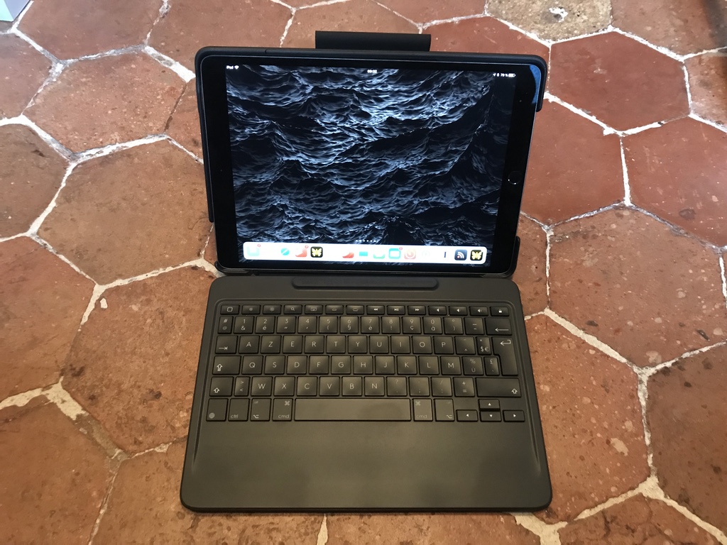
This is the next generation from Logitech, specifically for the 10.5. It’s basically an iPad laptop conversion kit, with included slot for the pencil. The iPad snaps into a protective cover with a Microsoft Surface style kickstand on the back. You can easily disconnect it from the keyboard and use it independently. Unfortunately the protective case is large, heavy and ugly. This seriously impacts the iPad experience when you’re not using it attached to the keyboard.
On the keyboard front, it’s OK. The keyboard feel is a little light, but it does the job. Things that are nice about the kit is that it uses the Pro connector so there’s no need to charge it and the keyboard is backlit. Currently the only back-lit iPad optimized keyboard that I know of.
From my perspective as a mobile keyboard solution it doesn’t really work very well since the back cover is huge and makes it as large as my MacBook Pro. If I’m carrying both, I want the iPad to be as thin and light as possible. If I were an iPad only person when on the go, this might make more sense, but the fact that I can’t use the keyboard while in portrait mode takes away one of my use cases.
The iPad is a little further from the keyboard which makes the swipe up from the bottom gesture a little easier to do which is critical with iOS 11.
If you want to use the iPad as a laptop remplacement it works quite well, but I feel that this use case loses some of the interest of the iPad as an iPad. Not to mention that it makes it considerably heavier.
Amusingly, it makes it feel so much like a laptop that I find myself making useless trackpad gestures to move the cursor while using it.
Apple Keyboard Cover
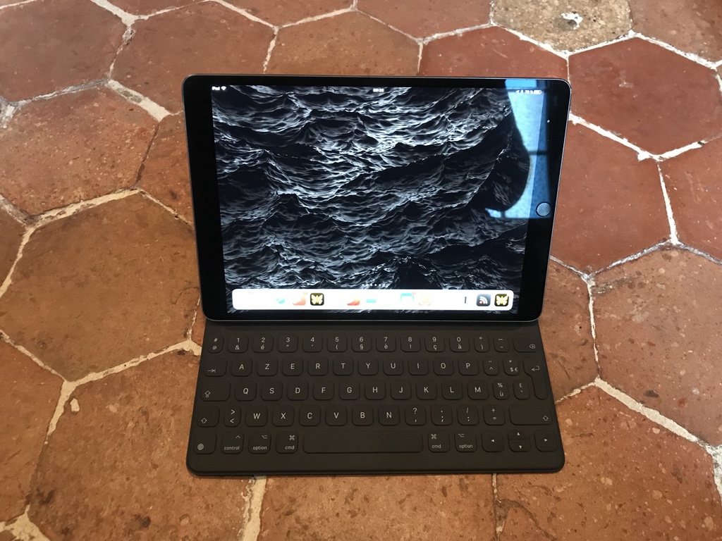
The latest generation of the Keyboard Cover is much improved over the last generation. Most importantly for me at the moment is the fact that they are making them in configurations other than QWERTY. I tried to go back to QWERTY and have discovered that I have definitively lost my QWERTY touch typing skills after 15 years in France.
The closest comparison is if they had integrated a Keys-To-Go into the cover but with better key travel and slightly bigger area for keys. Curiously, there are no iOS specific buttons above the numbers, but this gives them the possibility of a slightly better key spacing. This is another one that uses the Pro connector so no need to worry about the battery on the keyboard.
I’m stuck in landscape mode with this one again, but because it doesn’t have that extra space below the keyboard like a laptop it feels more iPad-like. Unlike the Logitech Slim Combo, when you take the iPad off the keyboard, all you have is the iPad.
The biggest difference between the Keys-To-Go is the weight since it has to assure the stability of the base, so the combination is probably heavier than a Smart Cover plus a Keys-To-Go combination. This does have the side effect that it is a little unwieldy when you fold the cover back behind the iPad as it’s thicker and heavier that just a regular cover so when I’m not actually using it for typing or as a stand I tend to tear it off the case completely and use it naked.
On the interesting front, you can use the 10.5 Keyboard Cover as a keyboard for the 12.9 as well. Obviously it doesn’t work as a protective cover, but if you have both and want to use the bigger screen for full-sized app multi-tasking this is an interesting option for those that live the multi-iPad lifestyle and need to use a keyboard with the bigger model from time to time and don’t want to buy both.
Before I replaced the 9.7 Pro with the 10.5, the Keys-To-Go was the default keyboard I took with me, but despite being a little heavier and thicker, the Keyboard Cover has become my standard daily carry. The convenience of having the keyboard right there every time I pull the iPad out of the bag is really nice. I suppose that this might be different if I’d also bought a regular Smart Cover with the new iPad, but the convenience of the Pro connector so I don’t have to charge it and the fact that it’s just that tiny bit bigger give it the win for me.
It takes some getting used to the folding gymnastics required to get the tri-fold in the right place with the connector, but it works.
Things I’d like to see
I’d really like to see Apple do something innovative like add a second Pro connector to the top of the iPad so that I can also use it portrait mode. Obviously there’s no space on the bottom with the Lighting port, but iOS doesn’t care which end is up and after using the Keyboard Cover with the 12.9, it’s clear that this should be possible although they’d also need to add magnets to the top as well.
Side note
The screen on the new iPad 10.5 is amazing.